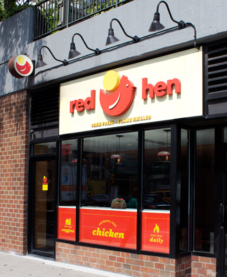
Red Hen
A restaurant brand so pure, simple, and honest that a child would understand and love it.

CLIENT
Red Hen
SCOPE
Positioning & Messaging
Brand Identity
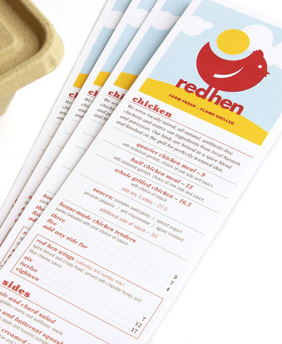
Menu Strategy
Packaging
Signage
YEAR
2014 - 2016
Honest. Clean. Pure. All natural. Farm-fresh semi-organic ingredients. How can you say all of the above without using grungy, fake-farmer aesthetics?
Create an identity so simple it looks like a child’s illustration. What’s more pure than that?
We are not always 100% in agreement with the idea that you can sell anything with clean, simple design — but in this case we knew it was the appropriate direction. First and foremost, because it matches the client’s approach to food and hospitality. Secondly, and equally important: